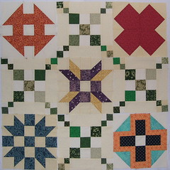
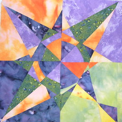
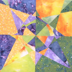
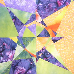
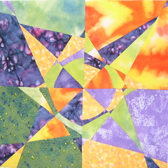
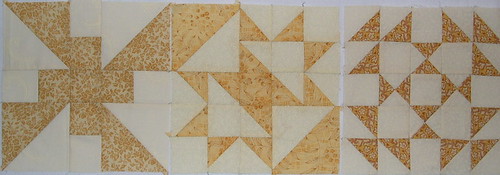
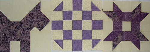
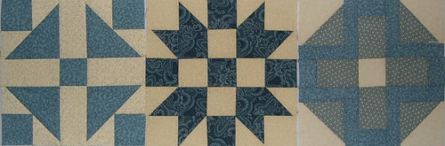
I smiled last week at Rian's comment of the old-fashioned look of my sampler in progress because it is exactly what I'm going for with this one. I consciously chose toned down medium values for the blocks--since these are not the fabrics that normally attract me, I thought it was a good way to stash bust, too.
Putting the blocks on the wall last week, inspired me to make more and to edit out a couple that weren't working ...
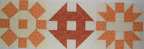
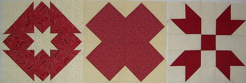
Anyone who has been making lotto blocks may recognize most of these and wonder what happened to Hope of Hartford and That 30's Thing. The latter, a paper pieced block, just didn't seem to have that old-fashioned feeling (despite it's name). My attempt at Hope of Hartford was too contrasty and ended up being added to the reject pile, along with my first Broken Arrows block--rejected because the blue-violet color felt wrong.
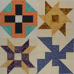
It feels like progress even though I still need a bunch more of the alternate blocks.