I think we all have our go-to colors and color combinations whether it's for quilts, the clothing we wear or the way we paint and decorate our homes.
I was thinking about color and how I choose colors today, as I went on my own little color hunt in search of fabric for a blouse that would work with a chunky cotton cardigan that was an impulse buy a couple years ago.
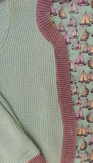
I love the mint green with gray color combination, but I always end up wearing it over a white shirt or gray knit top because I have nothing else, Today, on my way home from the farmer's market, I decided to see if I could find any fabric that was a color match for the mint green which could become a blouse. As I was waiting in line at the cutting table, the ladies in front of me were so excited that it had sailboats–they had apparently just been looking for sailboat fabric for a quilt. I confessed to them that I bought it solely for the color.
For me, sometimes finding the right color is as easy as matching something that I like.
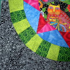
A few years ago, I was thinking that I wanted to try making a quilt from bright colors, so I decided to use brights for a set of Quilt-Along blocks that I would be making. Not knowing where to start, I chose a Laurel Burch print and decided to use it in each of my blocks.
As I blogged my progress with
these blocks I received a lot of compliments on the colors/fabrics I used. I did make a couple rules for my blocks, liking including both warm and cool fabrics and a black and white print in each, but, it was using using the color palette in the Laurel Burch fabric that gave me confidence that it would work.
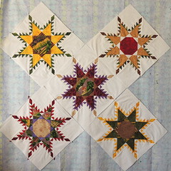
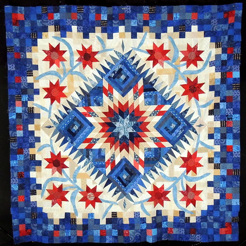
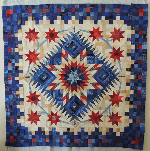
The idea worked so well for me that when I was choosing colors for the big traditional feathered star blocks I've been making and sharing on the
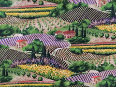
Daily Feather, again, I chose a fabric from my stash on which to base my choices. Here's the fabric,
Provence, from Michael Miller (and oldie that has been waiting in my stash for the right project) and the five blocks I've made so far.
I think the role of the inspiration fabric is less obvious in the feathered star blocks than in my bright QAL blocks, but, I'm confident that the result will still be a good one.
As I look at the blocks on the wall, I've been thinking I need to make more blocks with purple.
Seeing the photos of the fabric and the blocks, side by side, I can see that while I have used the same colors, I need to also consider the overall proportions in order to achieve the feeling of Provence.
We used a similar approach, earlier this year in the Tea Towel challenge, where the colors to be used in the quilt were supposed to be determined by the colors in the tea towel. My choice was a 1950's reproduction with a limited 4-color palette. It was a great exercise for me to limit myself ... and it was another project that, as I worked/blogged along, received a lot of comments and compliments about my color choices.
I think taking color inspiration from fabric, a photo or other work of art is a great way to climb out of our color comfort zone and try something new.
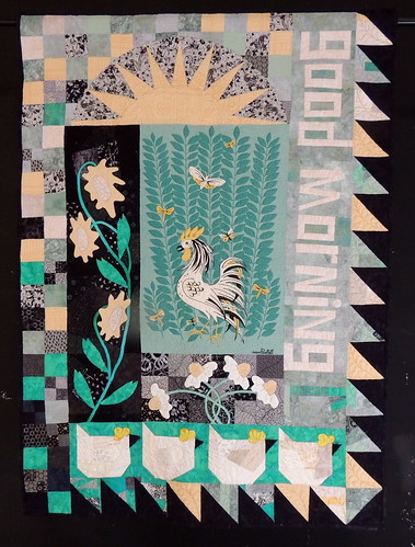
Speaking of new, yesterday, I was looking through the greeting cards in my desk and found some color palette inspiration for the stenciled feather on silk I made as part of my Daily Feather project.
The image is of a Picasso painting,
Two Girls Reading, an oil on canvass that I'd seen at the University of Michigan Museum of Art. I bought the card to remember the painting and what was, to me, an unusual combination of colors. When I saw it again yesterday, I immediately thought of the gold silk noil fabric on which I'd printed the black feather. My original plan when I stenciled that feather was to make a pillow cover, but it continues to assert that it wants to become an wall quilt. I have some ideas for design elements, but I've been stuck on finding the right colors to add ... until now.
Thank you, Pablo Picasso.
How do you step outside your color comfort zone? This month, I've asked the Block Lotto community to Blog about Color. I'm adding this post to the
linky party happening over there. Have you blogged about color? Feel free to join us.


 If you ask the vendors at the Farmer's market about the relative hot-ness of the chiles they sell, they will inevitably tell you that they're either "mild" or "medium hot" ... or they'll say something along the lines of, "you can never tell, they might be mild but sometimes you get a hot one."
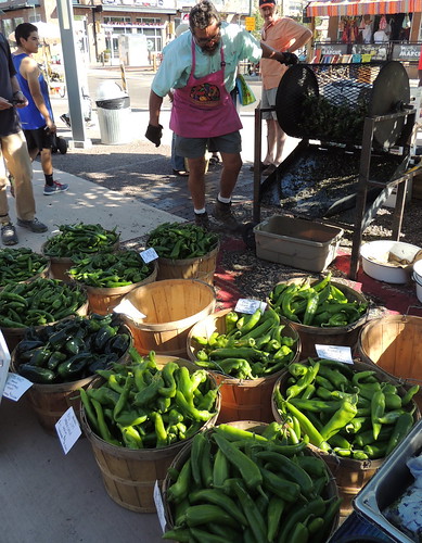
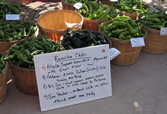 Most of the chiles at the farmer's market are identified in some way. Sometimes a grower will confess, "I don't remember what kind of seeds we planted." Most come with some sort of signage.
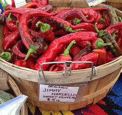

 Fabric is cut to make more of the traditional feathered star blocks ... but I have made only minimal progress. I joked with a friendly a while ago that I probably should re-label The Daily Feather blog as The Occasional Feather, unless I get back on track soon.
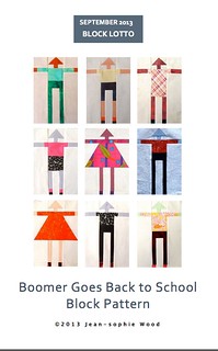 The tall variations of the traditional Oklahoma Boomer blocks are for the September Block Lotto.