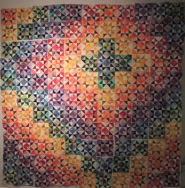
At some point after I started making the Broken Dishes Star blocks (as I think of them), I drew a symmetric, trip-around-the-work style layout and figured out how many blocks I'd need. And finally, I've made them all.
But lately it feels that asymmetry is more my style and so I started putting them on the wall that way and promptly discovered that the numbers of each color weren't going to work out for me ... so this is just a little bit off-center. Does it work or does it look like a mistake?
The artificial lighting in the studio is not good, but I'm not going to be home during the daylight hours for a while, so I decided to take and post a photo anyway. There are 121 of my monochromatic scrappy blocks (made for the Rainbow scraps challenge) on the design wall. I don't know if Judy plans to have a Design Wall Monday this week, but if she does, I'm ready. (She did and I updated this post to link to it.)


25 comments:
Gorgeous as is!
I think the blocks look really pretty in this arrangement
Sophie, it looks great. I much prefer asymmetry, and no it doesn't look like a mistake! Seems like you are back to feeling better, at least like working on quilts!
Oooh! The arrangement looks like a celestial swirl. Cosmic. Go for it!
I love the way it looks.
Helen
I think they look great the way they are. Just keep them up and look at them often. You will figure out soon if you like looking at them or not, if not just rearrange them again and you can always go back since you took a photo.
I am all for off center! I love the amazing feat of making all those blocks
It is really pretty. I'm a fan of asymmetry myself. Maybe push the center down a little bit more? It may help a little bit.
It's beautiful as it is. Don't spoil it by making it symmetrical! This was what you planned all along, wasn't it!
I love it! The asymmetrical layout really works with your blocks and colors. Gorgeous!
It totally works! Very nice!
Love the arrangement! Your colors are yummy. Thanks for sharing.
Hugs
I prefer symmetry, personally, but there's nothing wrong with this arrangement at all. I would probably have put the star even more into that upper right corner, if I could have, but this looks good!
love just beautiful
Wow! Just gorgeous, Sophie.
Love it just the way you have it!
I love it being off center! For a nano second I thought of printing and playing!
I think it looks fabulous!
Off center makes it more interesting.
I definitely think this off centre works beautifully!
Your quilt looks super.
I think it looks great... Just do it.
It's all about what looks good to you...not me...but I'm a symmetrical kind of gal.
It is perfect just the way it is!
It works as you have it laid out. It works! Such wonderful color play!
I. LIKE. IT.
It looks "floaty"
awesome!
Post a Comment